

Context & Challenge
EZ-Texting is a SMS marketing solution geared towards SMBs. The current app has grown organically overtime, becoming a slew of disconnected features that made the experience slow and complex to use. I was part of the team tasked with building a mobile app from the ground up. Our main goal was to redesign the the current experience of sending text messages for our users, making it seamless on mobile devices.
My role
I led the user research efforts and collaborated with two other designers on IA/wireframes/prototyping and design documentation for the following sections:
Home
Campaigns
Messages
Framing the problem space
We tested the existing web app with 2 customers. In addition we observed 80 user sessions on FullStory. Our goal was to understand the challenges our users had and workarounds they employed.Brought in 2 customers and had them walk through our existing web app to better understand their pain points.
Difficulty setting up contacts or importing them from an existing source
A cluttered nav confused users on how to monitor and respond to different types of messages they had
Lack of starter templates. Most our users are SMB owners and not savvy marketers. They felt stuck when it came to crafting a message to send to their customers. They expected EZ texting to offer them some starter templates.
Defining the scope for an MVP app
I conducted 17 customer interviews and sent a survey (1200 responses) to gauge our customers desire to conduct their core functional goals on a mobile device. The biggest takeaways were:
Customers operate most daily business tasks on their mobile device and would like EZ to offer a mobile friendly solution
Many of our complex features intimated our customers and the usability of core components of the web app left most users frustrated.

App feature request survey
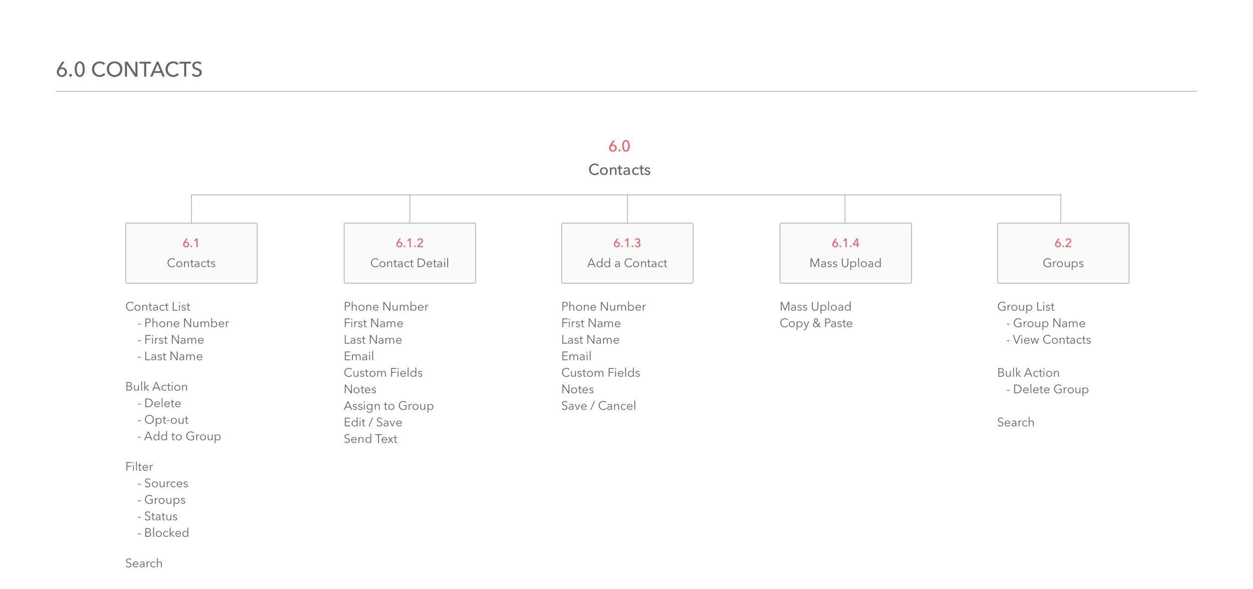
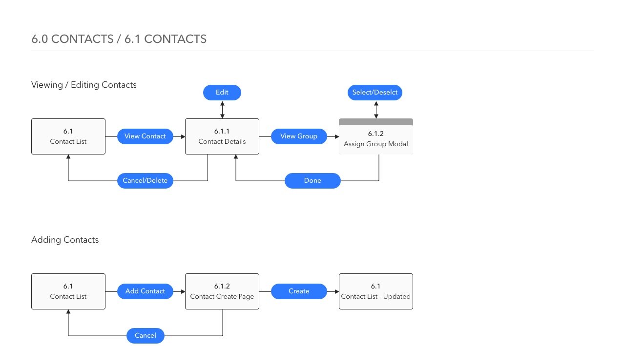
Structuring Content And Information Architecture
Before starting any design, we spent a great deal of time rethinking our existing workflows and sitemap. In addition we simplified the labeling and terminology of our core features. The following sections were the results of those efforts.
Log in and password recovery
Home (Dashboard view)
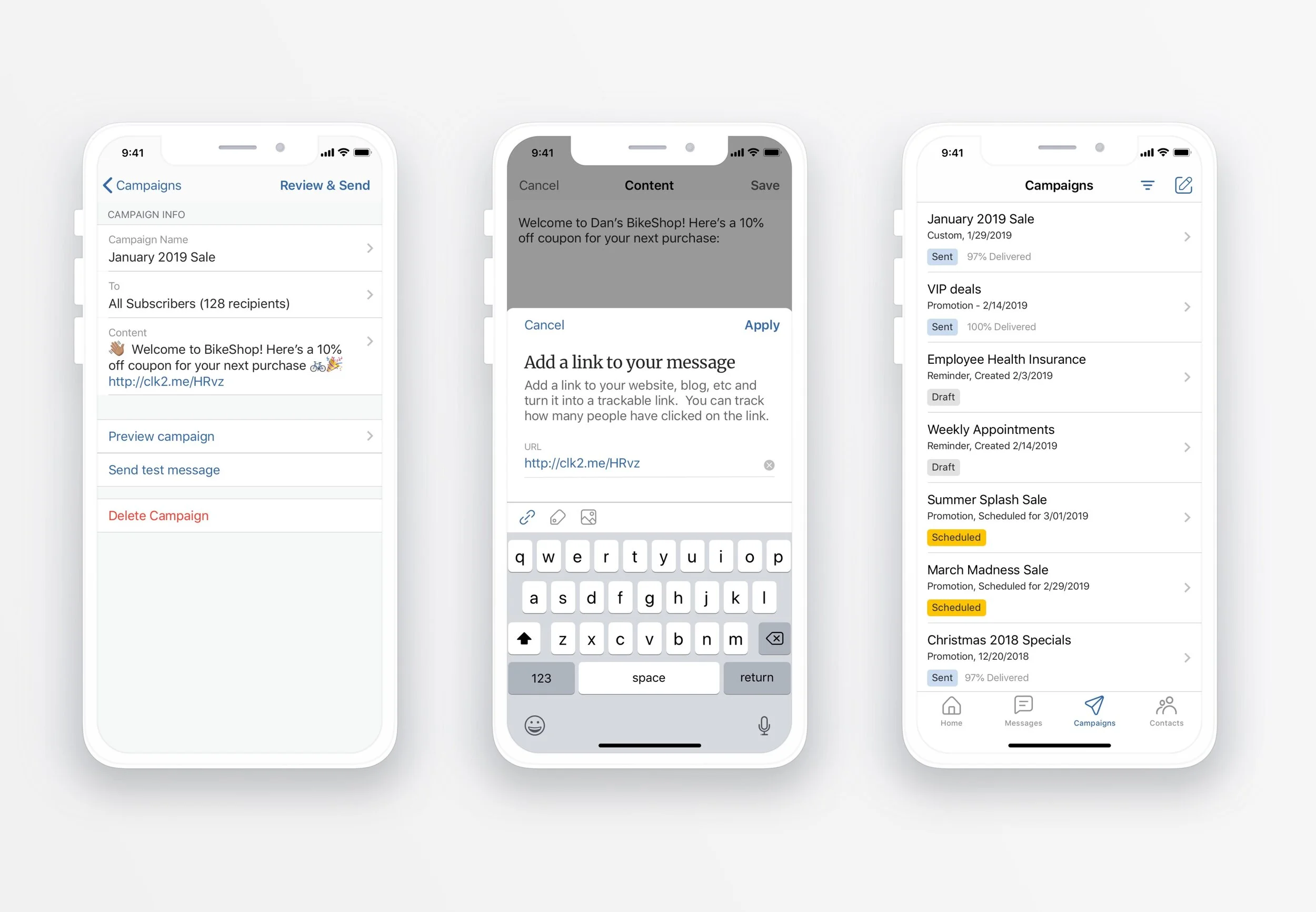
Campaigns (Mass Texting)
Messages (direct chats with customers)
Contacts
Account


Userflows


Sketching and wireframes
After a few rounds of sketching and low-fidelity wire framing, I conducted 2 rounds of internal usability testing with 9 participants to validate the designs. Following some feedback, I then translated the wireframes into high-fidelity mocks.


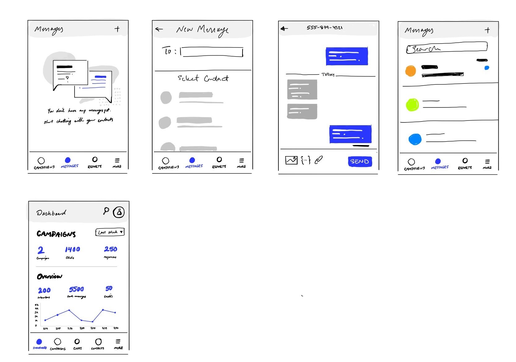
Wireframes

High-fidelity mock ups

Results & Reflection
After a couple of back and forth with apple reviewers, our app has finally gotten approval and is in internal beta testing with plans to ship in early Q4.
This is also the very first time the entire development of a project was conducted by an external dev house. This resulted in an extensive effort between me and another senior designer to work on design documentation offering detailed specs for each section of the app. It has been a fulfilling experience rebuilding a product from the ground up. Based on the apps performance and its impact on churn, its future iteration could see it become a standalone version.